Visualising points on a sphere
The goal
We wish to visualise the distribution of points that lie on the surface of a sphere. Perhaps we’re studying the motion of an object and the points represent unit direction vectors, or maybe we want to generate a particular distribution and need to check if we’ve succeeded. We’re going to use a map projection to do this, but first we’ll take a look at some basics regarding plotting with Python.
We’ll start by generating a large number of unit vectors in 3D. I’ve intentionally picked a non-uniform distribution so that we have something interesting to look at.
The data is saved in the following format
-0.811725 0.482269 -0.329422
0.753418 -0.560076 0.344493
...
-0.424620 0.651137 -0.629062
-0.925183 -0.162870 -0.342798
Histograms
Unless you have the head for it, viewing things in 3D can be confusing when you’re looking on a flat screen or piece of paper, so we want a way to visualise things that works naturally in 2D. The most naïve way to go about this is to simply discard the data for one dimension, in effect squashing the sphere flat. Lets see what it looks like with a simple scatter plot using Python:
import matplotlib.pyplot as plt
import numpy as np
data = np.loadtxt("data.dat")
x, y, _ = data.T
plt.plot(x, y, ',')
plt.axes().set_aspect('equal')
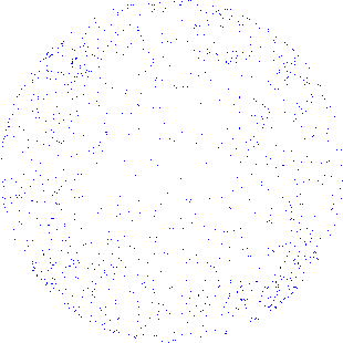
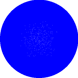
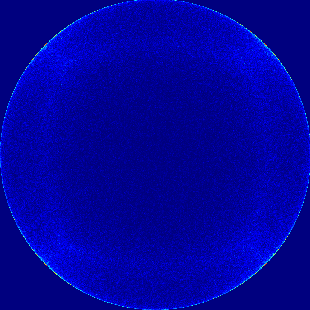
plt.show()The ',' option simply sets the point markers to be individual pixels. Anything bigger and we end up with so much overlap that we’re just looking at a blue circle. Figure 1 shows the result for 10,000 points.

Well… That’s ok I guess, but its pretty hard to interpret. It’s even more difficult if we have a lot less points (figure 2) or a lot more (figure 3).
Fortunately the solution, particularly in the many points case, is simple – just bin the data. The result is a histogram. In general this is one of the simplest ways to get nice plots out of dense or noisy data sets as the binning smooths things out. In Python its as simple as changing plt.plot(x, y, ',') to
plt.hist2d(x, y, bins=100)where, as you might guess, bins sets the number of bins in each direction.
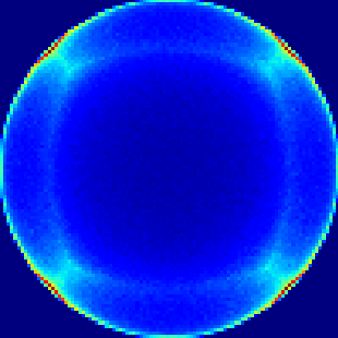
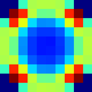
As you can see, this easily supports many more points than the scatter method. The number of bins you choose will depend on the amount of detail you want to see and number of points you have. If you use too few bins fine structure can be hidden (figure 5). If you use too many then you just end up with a scatter plot again as eventually each point has its own bin (figure 6). If you have larger sets of points you can use more bins and still get good results.
Making use of the z coordinate
Now that we have a nice way of dealing with large data sets we can tackle the bigger problem. Earlier we took the most naïve way of taking the 3D data and making it 2D, we unpacked the \(z\) coordinate into an empty variable _
x, y, _ = data.TWhen we do this we lose all information about whether the points are on the front or the back of the sphere. What if there were more points on the back than the front? We wouldn’t know.
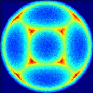
In addition, we really only have a good view of the front of the sphere whereas on the edges its hard to see what’s going on as it’s very compressed. In figure 4 we can see there is something going on in the four corners but it’s not really clear what.
We could try doing some sort of coordinate transformation to rotate the sphere:
theta = np.pi / 16.0
rotation = np.array([[np.cos(theta), 0,  -np.sin(theta)],
                     [0,             1,               0],
                     [np.sin(theta), 0,  np.cos(theta)]])

data_rot = np.array([np.dot(rotation, point) for point in data])
I looped the above code over a number of values for theta between \(0\) and \(\frac{\pi}{2}\) and put the resultant frames together into an animation (figure 7).
I think it looks kind of cool, but if you had to pick a single frame no then particular choice gives any more information than we had before. We still have hotspots in the corners because a lot of points are squeezed in there. That’s ok though, because there is another solution…
The Lambert azimuthal equal-area projection
We can unwrap the sphere, project it onto a flat surface, just like when we view a map of the world. Most of the common projections used for world maps aren’t really appropriate here as they do not conserve area. The preservation of area is really important, if we don’t have it then some areas will appear to be more dense than they should be while others will appear less. It will be impossible to tell anything useful about the density of points in our distribution.
There is a good choice that preserves area, the Lambert azimuthal equal-area projection. It maps \(S^2\backslash(0,0,1)\mapsto V^2\), i.e. the 2-sphere with \((0,0,1)\) removed, to the 2-disc. It should be noted that this maps a unit sphere to a disc of radius 2, not a unit disc. It makes sense when you think about it, would you expect a sphere and a disc of the same radius to have the same surface area? No – the disc needs to have a larger radius to match the surface area of the sphere. This is also clear from the expressions for the area of a disc and the surface area of a sphere.
The projection is given by
\[\begin{equation}\label{lambert-cartesian} (X,Y)=\left( \sqrt{\frac{2}{1-z}}x, \sqrt{\frac{2}{1-z}}y \right) \end{equation}\]where lower case coordinates are on the sphere, upper case are on the disc.
We can demonstrate that it preserves area by calculating an area element. This is fairly straightforward but does take a fair amount of manipulation. I suggest you fill in the gaps of the explanation below, it’s a nice exercise.
First convert all coordinates to polar. Again, lower case coordinates are on the sphere and upper case are on the disc. This gives
\[\begin{equation} (R\cos\Theta, R\sin\Theta) = \left( \sqrt{\frac{2}{1-r\cos\phi}}r\sin\theta\cos\theta, \sqrt{\frac{2}{1-r\cos\phi}}r\sin\theta\sin\theta \right) \end{equation}\]This gives us a pair of equations to solve, dividing one by the other immediately gives \(\Theta=\theta\) and then
\[\begin{equation} R=\sqrt{\frac{2}{1-\cos\phi}}\sin\theta \end{equation}\]follows easily.
This can be put into a nicer form by applying the half angle formula, the double angle formula, and by using the fact that we have a unit sphere (\(r=1\)). The result is
\[\begin{equation} (R, \Theta) = \left( 2\cos\frac{\phi}{2}, \theta \right) \end{equation}\]Inverting gives us spherical coordinates in terms of the disc coordinates
\[\begin{equation}\label{polar-inverted} (\phi, \theta) = \left( 2\arccos\frac{R}{2}, \Theta \right) \end{equation}\]We’re almost there now. In spherical coordinates an area element is given by
\[\begin{equation} dA = r \sin\phi\; d\phi\; d\theta \end{equation}\]Compute this in terms of the \((R,\Theta)\) coordinates by substituting \(\theta\) and \(\phi\) from equation \(\eqref{polar-inverted}\), remembering that \(r=1\). We get
\[\begin{align} dA &= \sin\phi \;2 d\left(\arccos\frac{R}{2}\right)d\Theta \\ &= R\; dR\; d\Theta \end{align}\]which is an area element in the planar coordinates! Great! As a quick point of comparison, the stereographic projection (which is another very common projection) does not have this property. Instead it is conformal (conserves angles), which the Lambert projection is not.
Now we can be confident that the projection is not going to mess with the way we view the distribution of points on the surface. Let’s see what it looks like (back in Cartesian coordinates now):
import matplotlib.pyplot as plt
import numpy as np

data = np.loadtxt("data.dat")
x, y, z = data.T
X, Y = [np.sqrt(2 / (1 - z)) * x, np.sqrt(2 / (1 - z)) * y]

plt.hist2d(X, Y, bins=100)
plt.axes().set_aspect('equal')
plt.show()
The result is visible in figure 8. What are we looking at here? First and foremost we can see the whole surface (well, except the point \((0,0,1)\)). Think about placing a ball on a plane, making a hole in top and then flattening the sphere down onto the plane by pulling open the hole. Points that are near the plane suffer less distortion and points that are near the hole get very stretched. In our case the sphere has been unwrapped from the side farthest away from us, onto a plane that is in contact with the close side. We could choose to unwrap around a different point – if there was a particular feature that we wanted to get an undistorted look at then we could unwrap around that instead. Although the whole picture is quite a distorted version of the surface of the sphere, the density of the points has been conserved by the projection as we proved above. We can now really clearly see the hotspots and how they have occurred at the four ‘corners’ of the sphere.
projection of our data
To get a better idea of how the mapping works lets try and rotate the points again (figure 9). You can see the stationary points in the top and bottom circles that everything seems to rotate around, those are the poles of the original sphere. Indeed, substituting \((0,\pm1,0)\) into equation \(\eqref{lambert-cartesian}\) gives \((0, \pm\sqrt{2})\).
axis with the Lambert projection
Other distributions
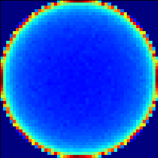
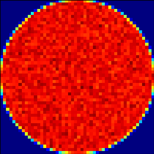
Let’s take a look at some other distributions to see how the naïve method compares to the Lambert projection. First, we examine a uniform distribution. In figure 10, where the \(z\) coordinate has been discarded, we can see that it really doesn’t appear to be uniform. If the distribution really is uniform then we would expect our plot to reflect this, instead it’s quite dark in the middle and fades gradually to quite light near the edges (I’ve used 50 bins here as it gives better contrast, making this more obvious). Compare this to the Lambert projection in figure 11. Despite a bit of noise, it really is very constant across the circle, as we expect it should be for a uniform distribution.
discarding the z coordinate
using the Lambert projection
Next is a tricky one, it has bunchings of points near the poles. I think this case is a bit less clear that the Lambert projection gives an advantage, but look closely. The simple method (figure 12) clearly does show the strong hotspots at the poles but fails to show the spread around them. This is much clearer using Lambert (figure 13). In addition the simple method still gives a fade out around the edges of the circle. This distribution should be fairly constant around the equator which it is with Lambert.
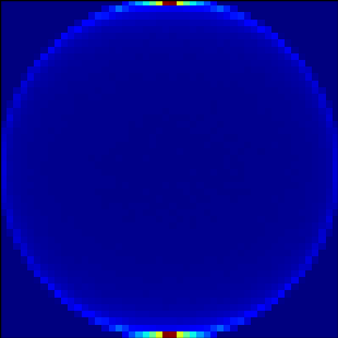
discarding the z coordinate
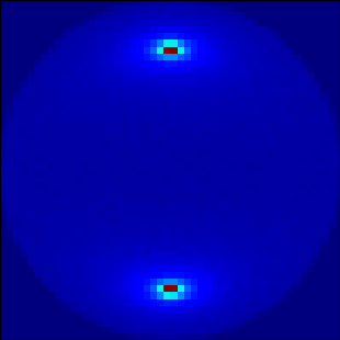
using the Lambert projection
Conclusion
Hopefully I’ve demonstrated that the Lambert projection is a useful way of visualising points on a sphere but to finish I would like to stress that this is only one way of doing things. For one, there are many other projections. I like the Lambert projection because it has a simple form and conserves area but maybe a different projection is more appropriate for your purposes. Maybe no projection at all is the most appropriate. Always keep in mind what you’re trying to get from the data – don’t use a projection just because you can if doing so obscures understanding.